
2021 IEEE PacificVis Visual Data Storytelling Contest accepts video, data comic or infographic that uses visualization to communicate a narrative, a message or a series of insights. This year we received 12 submissions, which were reviewed by 8 judges, and ultimately 4 works were shortlisted. The winners will be announced during PacificVis 2021.
To view all shortlisted entries, please visit the Storytelling Contest Showcase on Vimeo.
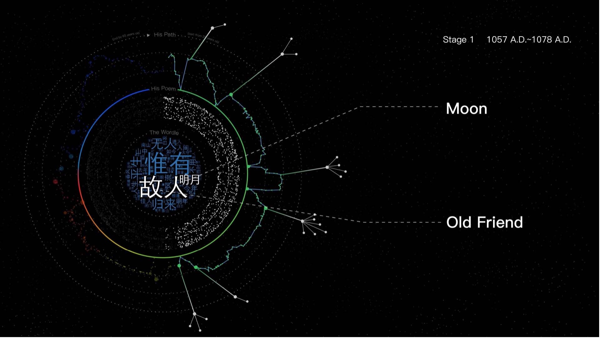
1: HoagsOLife: A Visualization of the Life Story of Dongpo [vimeo] [Winner]
| Yixuan Li | School of Data Science, Fudan University, Shanghai, Shanghai, China |
| Tian Gao | Intelligent Big Data Visualization Lab, Tongji University, Shanghai, China |
| Yang Shi | Intelligent Big Data Visualization Lab, Tongji University, Shanghai, China |
| Prof. Nan Cao | Intelligent Big Data Visualization Lab, Tongji College of Design and Innovation, Shanghai, China |
| Siming Chen | School of Data Science, Fudan University, Shanghai, China |
Abstract: Su Dongpo is one of the most famous and legendary poets in Chinese history. His fame is not only because of his peerless masterpieces but also the ups and downs in his life. In this data video, we use a novel visualization HoagsOLife contructed by D3.js, in reference to Hoag's Object, to present a story about Dongpo's life journey, his poems, and the dishes he created. Using this metaphor, HoagsOLife is composed of chronic rings, extended branches, and an interactive core, encoding his life trajectory, the dishes, and the poems accordingly. The input data is publicly available. NLP techniques, including TF-IDF and sentiment analysis, are also adopted as supports to our study. Through exploration, we find Dongpo's desire and the efficiency of writing and expressions used in poems were closely related to his political status. Meanwhile, even in a challenging situation, Dongpo could overcome the sadness by creating foods as joy.
2: Los Angeles Lakers - Leave a Legacy [Website] [Video] [vimeo]

| Zini Zhu | Department of Computer Science, University of San Francisco, San Leandro, California, United States |
| Baoying Yuan Yuan | University of San Francisco, San Leandro, California, United States |
| Alark Joshi | Department of Computer Science, University of San Francisco, San Francisco, California, United States |
Abstract:
For this storytelling project, we downloaded and analyzed the Los Angeles Lakers
championship records and regular season records from NBA stats official website
via an open source api called nba-api.
The api provided endpoints to fetch all NBA teams’ game stats and team rankings.
The scraping scripts are written in Python with Jupyter Notebook. For data about
the Lakers drafts and game information from 2011 to 2018 as well as the 2020
playoffs, we downloaded it directly from Basketball Statistics and History.
Through the scrollytelling approach, we were able to draw the viewer’s attention
on specific aspects of the story in a more explanatory manner. We used both
Waypoints and Scrollama for scrolling effects, d3.js for the interactive data
visualization and d3 utility packages such as d3-annotation and d3-textwrap for
the annotations.
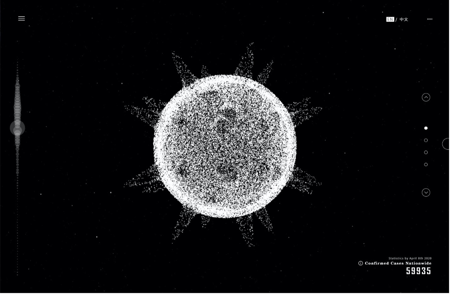
3: Flowing Boundary: Data-driven Interactive Narrative Visualization about Covid-19 in China [vimeo] [Honorable Mention]
| Juanjuan Long | Design school, Jiangnan University, Wuxi, China |
| Junlin Zhu | Design school, Jiangnan University, Wuxi, China |
| Rui Wang | Jiangnan University, Wuxi, China |
| Wei Zhou | Design school, Jiangnan University, Wuxi, China |
Abstract: In the special context of the global spread of Covid-19, this project uses visualization to present different dimensions of information and data in the process of fighting the epidemic in China. The metaphorical visual language and interactive web communication format narrate the dynamics of the epidemic and the twists and turns of individual destinies. The exploration of the four chapters is supported to provoke empathy and reflection in the reader.
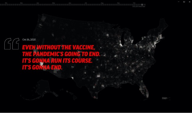
4: Trump's Year of COVID [vimeo]
| Bill Shander | Beehive Media, Boston, Massachusetts, United States |
Abstract:
This is a story tracking COVID-19 in the United States, using data from
Johns Hopkins University. The data was used to generate 365 dot density maps
showing each person who eventually dies by county across the US as a white
dot - a "light". Over the time period, those lights "go out", corresponding
to the date of each person's death. This is juxtaposed against quotes from
Donald Trump downplaying the virus repeatedly over the same time period. The
quotes were sourced from CNN, a US Representative's website, and the Trump
Twitter Archive. Music is by Moby, via MobyGratis.com. The maps were
generated in D3, and the animation was partially automated in D3, then the
rest of the video was assembled in Adobe Premiere.
This should be viewed full-screen. It is "data art", and was envisioned as
an exhibit in a museum or at least played on a large screen. It was not
designed for the phone, for example. The subtle visualization showing dots
slowly disappearing - a rare subtractive visualization - was very
intentional, and also intentionally subtle. The goal is that people will
"feel" this story, as much as they will "understand" it. In fact, it begins
with feeling and understanding probably only comes at or close to the end of
the 5 1/2 minute experience.